8.09.2008

Simple Shortcuts

Because I tend to reference a command and not explain what it does, I thought it best to create a blog about some shortcuts that, once you master, will make GIMPing (yes I did just turn GIMP into a verb) much easier. :) Now, praise me for my kindness! :D Or don't, whatever man.

I should make t-shirts.

  • New Layer: CTRL+SHIFT+N
  • Select entire canvas: CTRL+A
  • Zoom IN: SHIFT + +
  • Zoom OUT: -
I know it's not much, but those are extremely useful. I'll post the full set of commands if anyone REALLYYYY wants them. :) Enjoy! Go forth and GIMP it up.


7.24.2008

What is Web 2.0?

Web 2.0 is an amazing design concept (apparently because everyone's using it). It's a rather respectable design concept with its sleek buttons (that are all incredibly shiny) and its stripes... oh those stripes. It calls for simplicity with a modern twist, although, for some reason simplicity is always regarded as modern. I've done enough ranting... Now, let me teach you somethin' or another. :D

Should I create a banner... a background?... perhaps... perhaps A BUTTON. A simple button that is rather revolutionary. Why? Because, my friends, it is shiny.

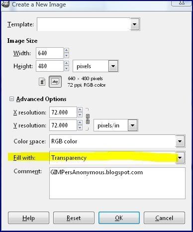
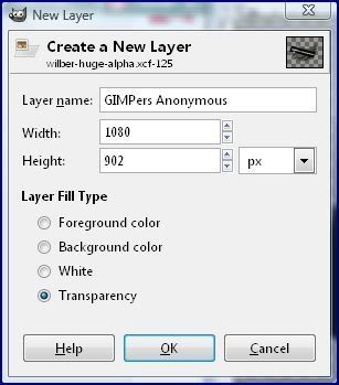
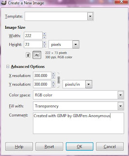
1) File -> New. Once you arrive at the dialog box, change the 'Background Fill' to 'Transparent' and set the size to 222 x 73, as shown:

2) Hit CTRL+A to select the entire box.

3) Then, click Select -> Rounded Rectangle. Its default setting is 50% (that is what I used for the button above). You can increase it or decrease it if you like, but I suggest that you leave it as is.

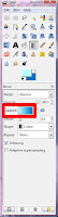
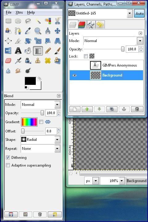
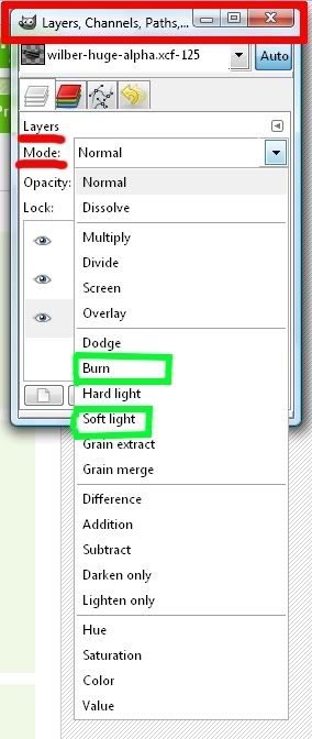
4) Now you want to add the gradient. I chose b5ffff as the lighter color (double click on a color to edit) and 0071c6 as the darker color. Select the gradient tool and choose the one that matches your color choice by clicking on the box after gradient (Click to enlarge):

5) With the gradient tool selected, click the top of the box (or near it) and drag down towards the bottom.

6)The next step is to create a bevel effect, which I did not know how to do, so I Googled it and found the following page: http://www.novell.com/coolsolutions/feature/17391.html. Then return here once you've created the bevel effect. I was able to follow the tutorial relatively well, which is the reason why I am posting the link.

7) Now, you want to make it look shiny. :D Select the rectangle tool, which is the first tool in the main box and looks like this:Image and video hosting by TinyPic You want to select a small space as shown here:
Image and video hosting by TinyPic


8) Click Select ->Rounded Rectangle.

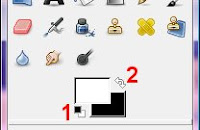
9) Select the paint bucket tool and change your main color to white. You can do so quickly by clicking the small black and white rectangle (1) then click the arrows (2). (Shown to the right)

10) Click on the window with your button. Hit CTRL+ALT+N and hit 'Enter'.

11) Now click (with the paint bucket tool selected) inside the selected area. Then change the transparency to 67%. Adjust the transparency to what you prefer.

Now you can add text or use it however you'd life. :) Enjoy your Web 2.0 button.

5.15.2008

An Apology

I'm really sorry that I haven't posted any tutorials in a while :\

I have quite a bit of work to accomplish before my school year is over!

Once I can start posting again, sometimes within the next two weeks, I plan on posting tutorials on the following topics:
  • Easy Web 2.0 stripes
  • Simple Web 2.0 backgrounds
  • More how-tos with filters and tools
  • And maybe I'll create some myspace tutorials... *shivers*
  • Nifty things to spruce up your images
  • AND MUCH MUCH MORE!
I could throw up slapshod tutorial, but I'd much rather focus on quality and not quantity :D
Please come back soon to check out the new tutorials!

5.04.2008

How to make a Blogger Banner

I suggest that you find inspiration somewhere. I found my inspiration at www.istockphoto.com. It helps to get your mind going by just looking at abstract images. Once you see something that inspires you, create your own original work or, if you want, purchase the image that inspires you.

The banner size to use is 713x142. I did not originally realize that and so my banner hangs off the side a bit. :-\

The Beginning Steps:
  1. Open GIMP
  2. File->NEW
  3. Change WIDTH to 713 and HEIGHT to 142
  4. Click on ADVANCED OPTIONS and change FILL WITH to 'transparency'


From this point, it's a matter of what you want to do. What type of background do you want? Do you want text in your banner? If so, then:
*Click on the text tool, which looks like the letter A
*Choose font, size, etc...
If you want your text to have a pattern or something besides a plain color, check out: http://gimpersanonymous.blogspot.com/200...

A tutorial on layers: http://gimpersanonymous.blogspot.com/200...

Additional info:
  • First, save the image as a .xcf file, which is GIMP's file format. It will preserve the layers and make it easier to work on in the future. :)
  • Save the image as a .png file [so you can preserve any transparency and it will be a higher quality.

To add it to your blogger blog:
  • From your Dashboard, click 'Layout' [shown to the right]
  • To edit your header, go to the box under NavBar and click 'edit' [shown below]


  • To insert the header you created and saved as a .png, select the file on your computer by clicking 'browse' or select an image from an account, such as photobucket. {I personally suggest that you take the image right from your computer}
**Click on images to enlarge [opens in new window]

4.30.2008

The Path Tool!

How to? Why? Huh? OH YEAH!

This is an introduction to the ever-useful path tool. :)
First off, an image to better help me explain:

1) Design [aka creating the path]
Just click along the part you want selected

2) Edit [aka editing your path]
You can use this to smooth out your path and make it exactly what you want it to be :D

3) Selection from Path [turns your path into a selection that you can make use of]
Do you want to move it into a different image? Now you can! Cut [ctrl+x or Edit->Cut] and treat the selection as any other item on the clipboard. Paste [ctrl+v or Edit->Paste] it where you want it! :)

4) Stroke Path is simply taking your path and turning it into a visible shape or line.

The thickness can be set by you in the dialog box that follows:
What you need to worry about is mainly the stroke line width [highlighted] and color [the foreground (FG) color, which is the black box in front of the white one in the first image... or main color].

I hope this is a helpful tutorial! If you have any questions, just comment away!

4.29.2008

Make Your Toolbar More Useful

So, in my spare time, I answer questions on Yahoo Answers relating to The GIMP. [My Profile] Anyhow, I have found that this is the best way to learn what to put on this blog... what do beginners really need to know? Well, anyhow, this particular blog makes using The GIMP go along a little smoother. I recently figured this out so I'm uber excited to put it out there! :D

Start by clicking:
Dialogs-> Create New Dock->Layers, Paths, Channels.

Now you have that open.

Then, Dialogs->Create New Dock->Brushes, Patters, and Gradients

Now you have that open.

Now, the fun part :)

Click on the brushes tab [the circle] and drag it to the bottom of the "Layers, Channels, Paths" window. NOTE that there are two locations the "brushes" tab can end up. One being next to the other tabs in the window or underneath.
You don't want the entire box to be 'highlighted' just a small rectangle underneath. :)

To get it underneath it, drag it so you see a small rectangular box that is darker than the rest at the very bottom. Then, let go and drag the gradients and patterns over as well next to the brushes. :D

VOILA! You now have the most used tools right there always visible :)
Enjoy! :D

I'll be adding more images soon... Prt Scrn isn't quite working tonight. :[

4.27.2008

Adding Gradients to Text

*Click to enlarge images :D

1) Start with a NEW file [File->New] and set the background to transparency

2) Open the Text Editor


3) In the "Layers, Channels, Paths, Undo" right click on the text layer and select "Text to Selection"


4) Hide the Text layer by clicking on the eye and select the Gradient [aka Blend] Tool. Also select the 'Background' layer


5) Drag the gradient tool across the selected area [which should look like the text] creating the desired gradient.


6) Now click Select->None or use ctrl+shift+a to remove the selection. Now save or use as you'd like :D


**Tips: [UPDATED: May 4, 2008]
  • Instead of a layer with a gradient, you can put an image, pattern, or anything you can think up creating a different look more tailored to your needs. :D
Enjoy! :D

IWarp


The IWarp tool is pretty similar to photoshop's liquify tool.


How to use it:
Filters->Distort->IWarp

Now you have the IWarp dialog box open. The default settings really don't make a change in the image so I suggest you increase the "Deform Radius" and the "Deform Amount". Now click on the image in the box to alter it. The tools are pretty self-explanatory and will actually do something now that you have increased the strength.

Working With Layers

Do you have the "Layers, Channels, Paths, Undo" window open? It looks like this:


In order to add a new layer you can either click Layer->New Layer shown here:
OR you could hit ctrl+shift+n
A dialog box will then pop up, which looks like this:

Blend modes for layers?
For blend modes, look at the "Layers, Channels, Paths, Undo" window

Switching between layers is simple, all you have to do is click on the name of the layer that you want to work with in the "Layers, Paths, Channels, Undo" window, which is shown in the first image.

A Creation


I made a motivation poster [frame] stamp :D

If I get enough requests, I'll make my brush available!

4.26.2008

All About Brushes

What Will Be Discussed:
  • How to make a custom brush in The Gimp
  • How to convert PhotoShop brushes into brushes for The Gimp
Custom Brush:

1) Start by clicking File->New
2) Then click on Advanced Options

3) Then create the black and white image
*Now, at this point most tutorials would tell you to save, BUT I learned [the hard way] that when you save at this point, the white spaces do not become transparent as is claimed in many tutorials when you save it as a .gbr file.
4) Select the "Select All Colors Tool", which looks like this:
5) Click on a white part of your image and hit the "Delete" button.
6) NOW save the image as a .xcf file if you would like to work on it some more in the future and also save it as a .gbr file to the brushes folder.
Where is the brushes folder?! I searched for it using the search tool on my computer [the one located in the START menu]. I found it here: C:\Users\Put your username here\.gimp-2.4\brushes

**Tips:
-It's okay to make the brush much bigger than you need it to be because it won't become distorted when you shrink it, but a smaller brush will become distorted when you make it larger.

Converting PS brushes into GIMP brushes:

This site seems to have a really good tutorial. I couldn't figure it out on my own so I don't feel that it would be right to post a tutorial about it as if I did. I just wish the grammar on that page was better. *grumbles*

FAVICON!

I finally have a favicon! To create it, I used The Gimp and a Favicon Editor. This is the very first favicon I have created and I would say I'm pretty proud of it!

I used a GIMP tutorial here to create the background for my favicon. :D

I've also created a mini banner for this blog:
gimp, photo editing, free, anonymous, blog, photo


I'll be making up for my lack of blogging today! I have an interesting blog coming right up :D

4.16.2008

Welcome to GIMPers Anonymous!

Hello there. My name is Sam and I'm kinda in charge of the place. :D

There are two paths you can take in this conversion. Honestly, for those who photo edit regularly or who have been relying solely on PhotoShop for their graphic needs will soon see the light [aka legally free software that's just as good as the stuff you pay tons of $$$ for].

Do you want an experience that is similar to PhotoShop, but not pirated or illegal? And be part of a movement to advance open source software? If yes, follow me here. Let me WARN you in advance that it will not look the same and will not be the same exact thing.

Or do you perhaps feel that you can handle the real deal and make your transition into The Gimp? I chose this route because I did not know there was another way, but I'm sticking with The Gimp now that I realized that it works for what I need. It's just a matter of learning all the ins and outs. :D *hopeful*

Here is someone who successfully made the transition from Photoshop to The Gimp... well, GimpShop, but it's close enough. Check it out! :D

Still not convinced?
Read: GIMP vs. PhotoShop

One more link: http://www.gimp.org/tutorials/Draw_A_Paint_Brush/